9:41

9:41
X 9
Users would rather choose a third party app to order from McDonalds rather than using the current north-india
McDonalds mobile app as they believe it isn't up-to the mark for such a big brand.
The coupons that are visible on the app cannot be added to cart/order.
There is no chat-bot or live customer support.
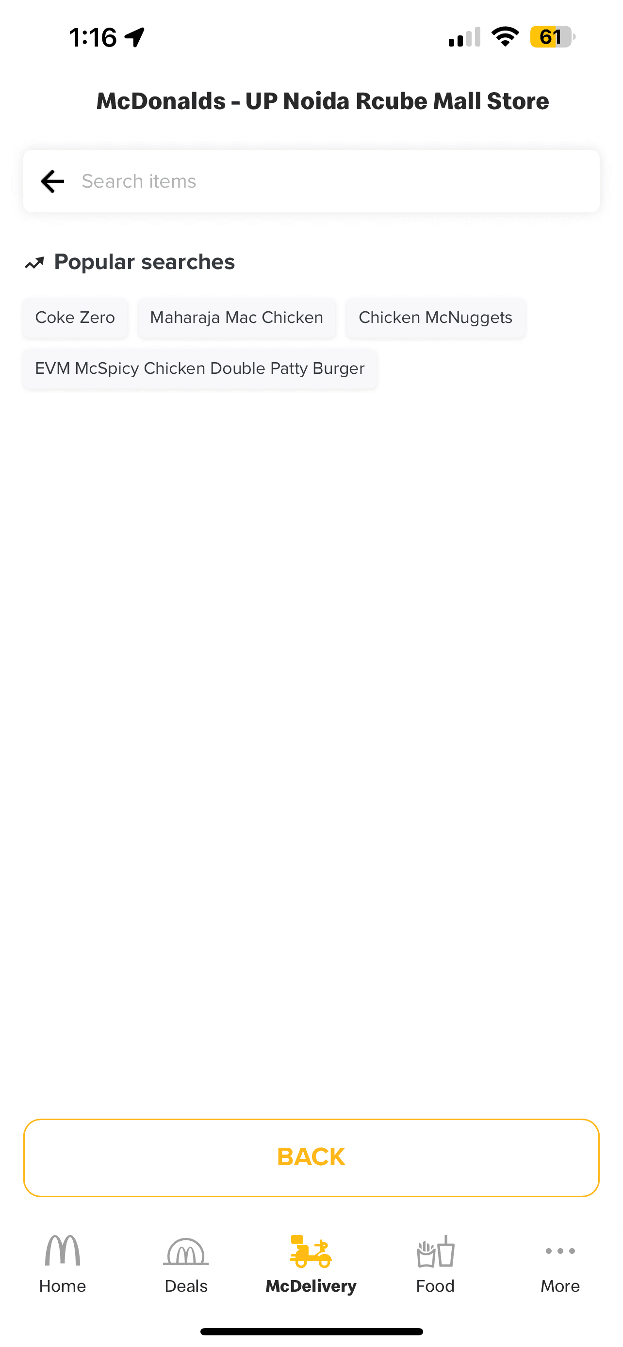
The app is confusing to the user as the user has to scroll through the app, to be able to find what they're looking for.
There are way too many banners used throughout the app.
X 21
Respondents
About the same
Worse
Much worse
Better
No
Yes
Neutral
Below expectations
Meets Expectatitons
Doesn't meet expectations
8%
17%
25%
25%
25%
1
2
3
4
5
0
2
4
6
8
Order Placement
Points/Rewards
Offers & Promos
Nutritional Info
None
Conducting a comprehensive heuristics analysis of the current McDonald's North India mobile application, evaluating both the iOS and Android versions.
1
6
6
8
9
8
10
10
11
12
14.
15.


Experiences slow delivery and cannot track orders after they have been placed.
Runs low on funds and relies on coupons and discounts at the end of the month.
Reports of frequent app crashes or freezes.

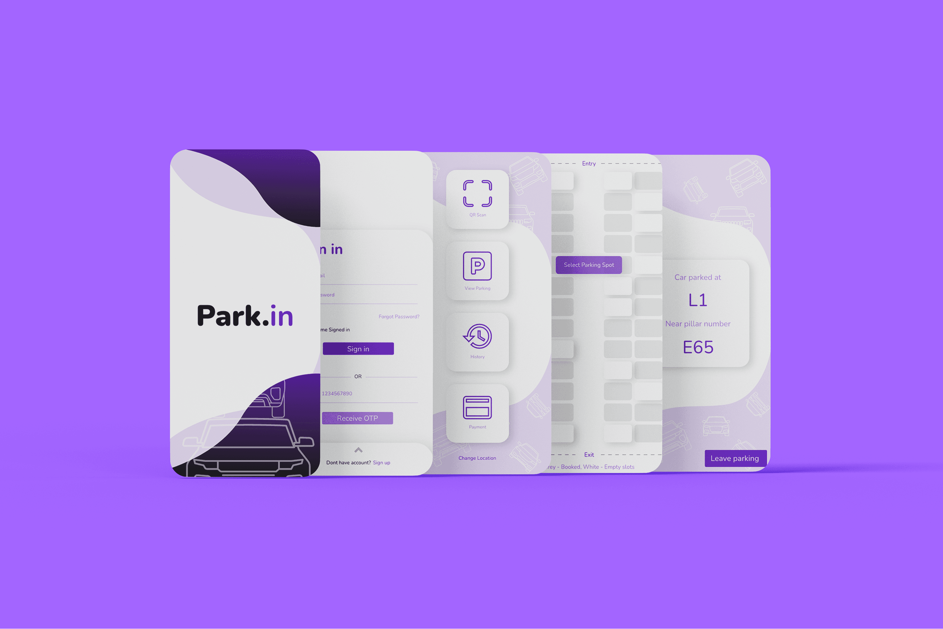
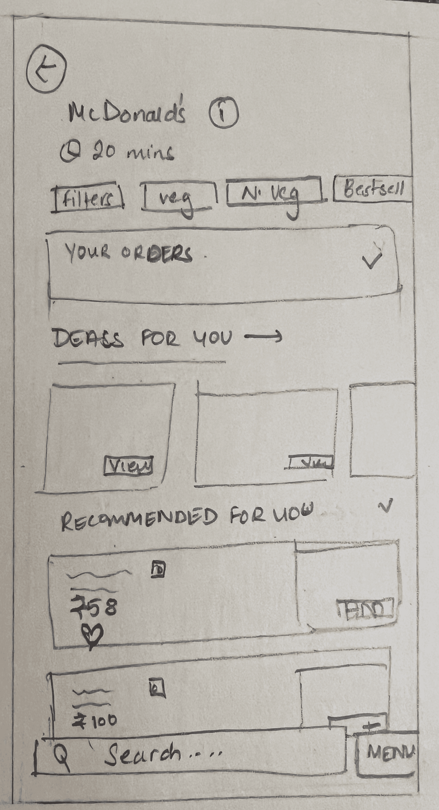
After conducting thorough research and narrowing the options to a few potential MVPs, I began sketching ideas on paper. This approach allowed me to explore various concepts for redesigning the existing application, with the goal of enhancing its overall user experience.
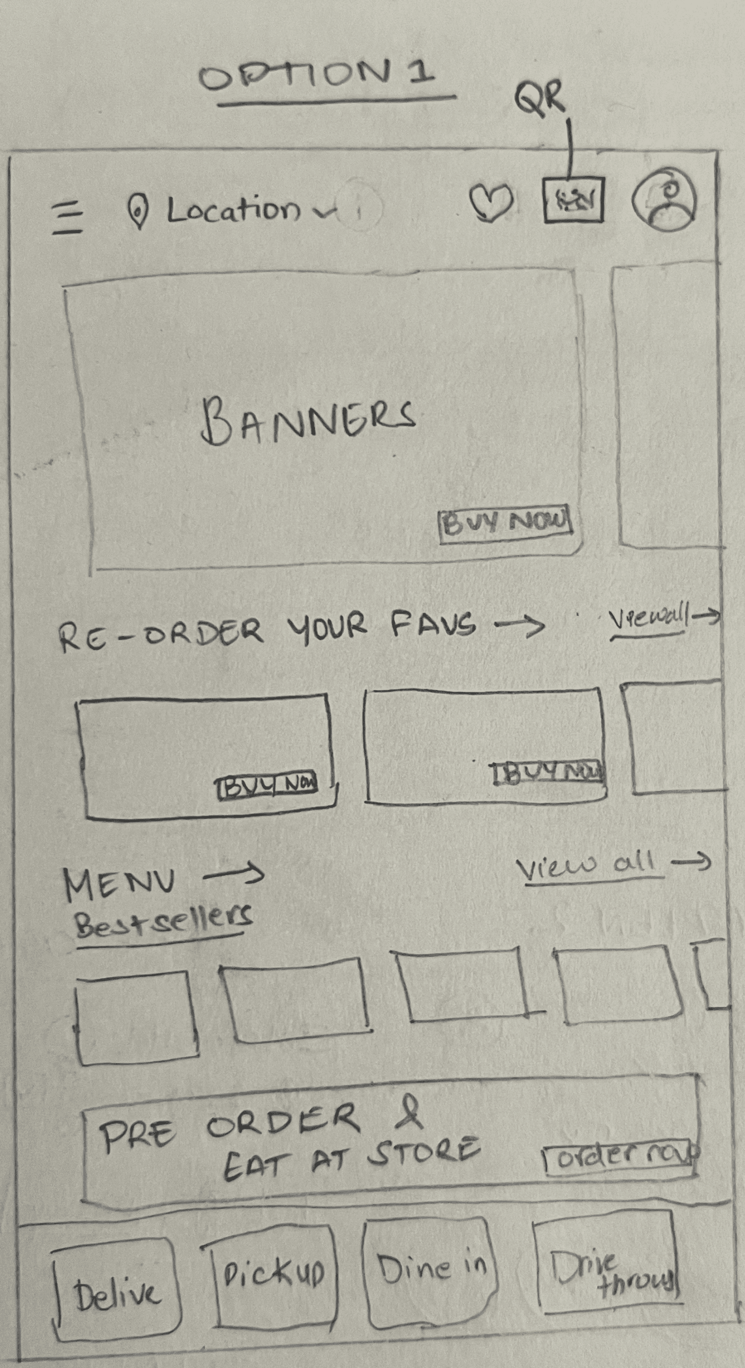
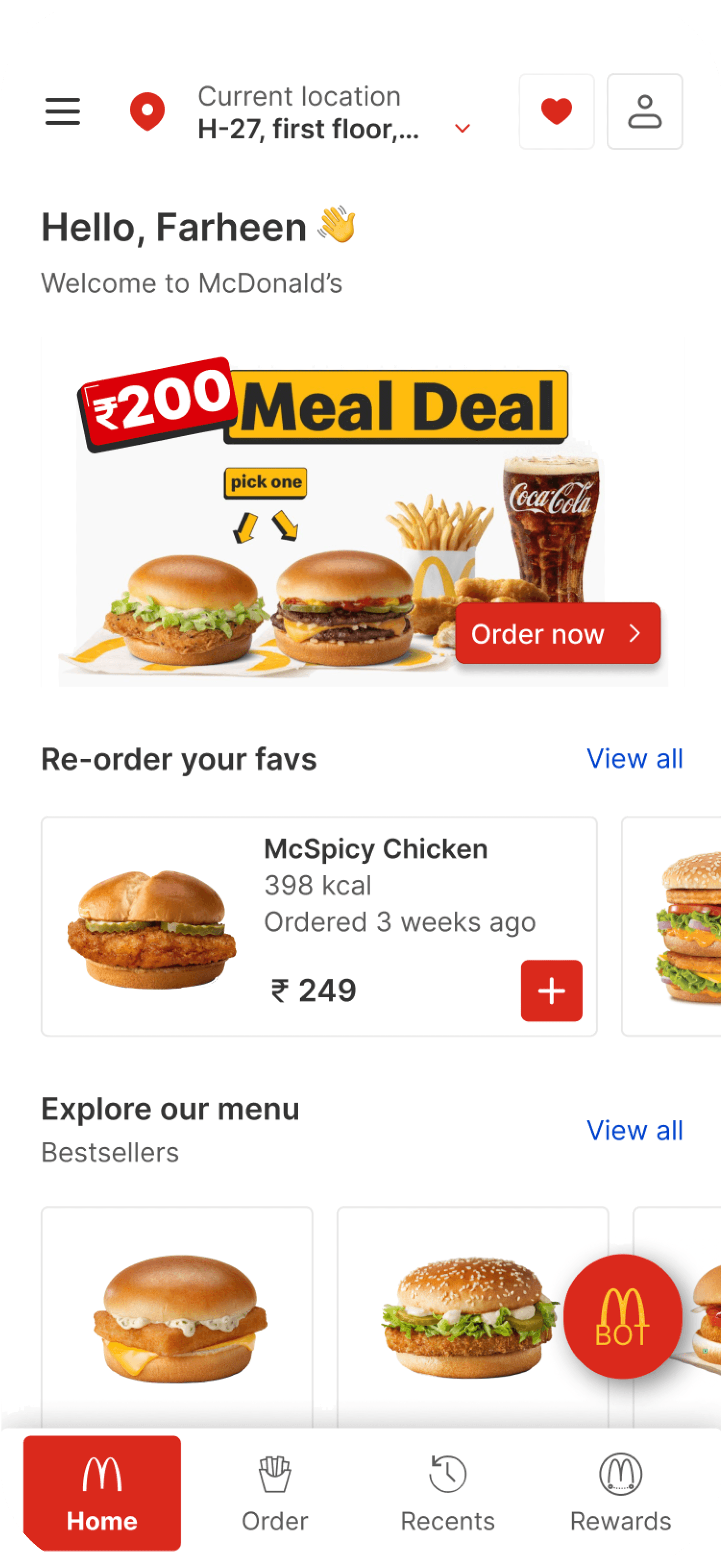
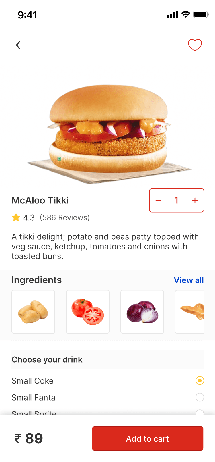
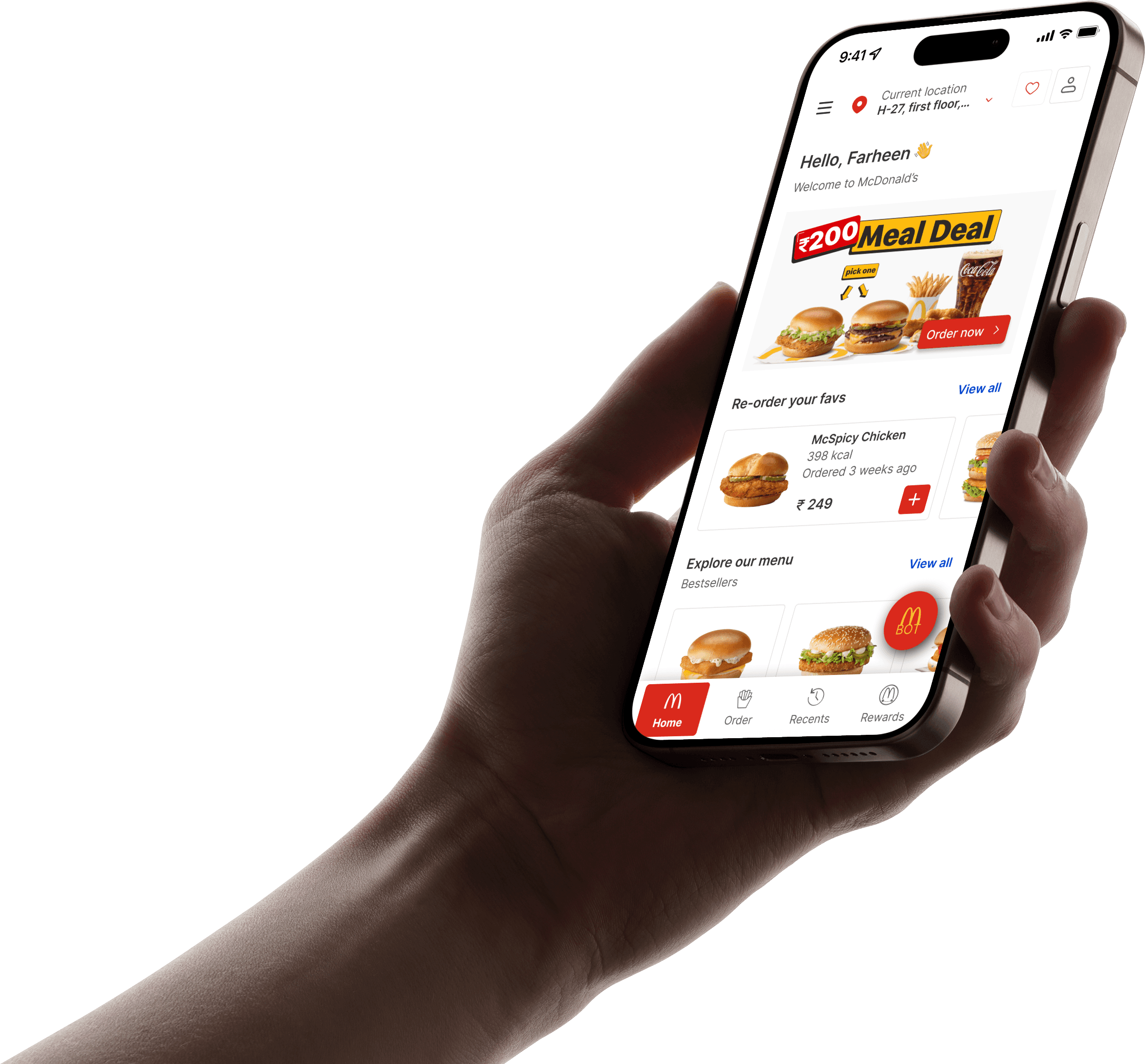
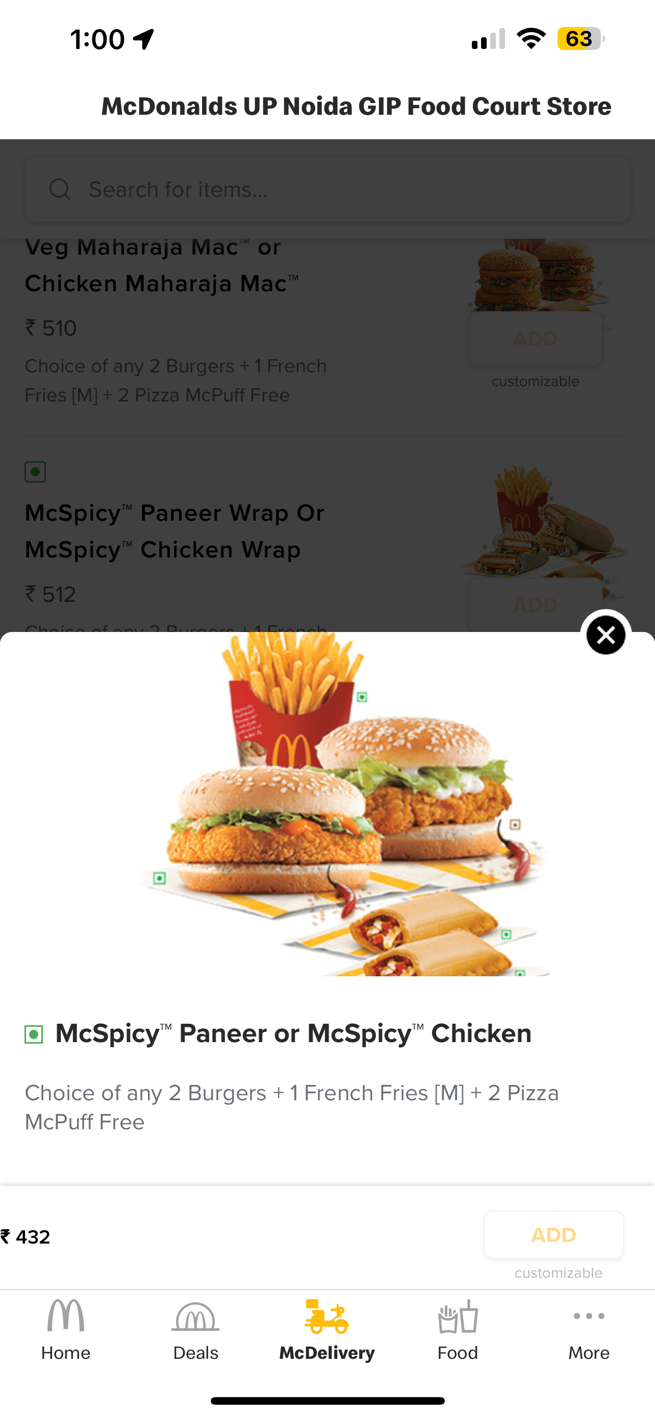
Hamburger Menu, location of where the order will arrive, favourites option provided, QR scan option provided
Banners have been added with a buy now button
Re-order will be available on the screen
Menu will show bestsellers at first, with view all option at the end.
Pre-ordering before reaching store is an option as well.
Chatbot has been introduced, that will help place orders for those who want it done in seconds.
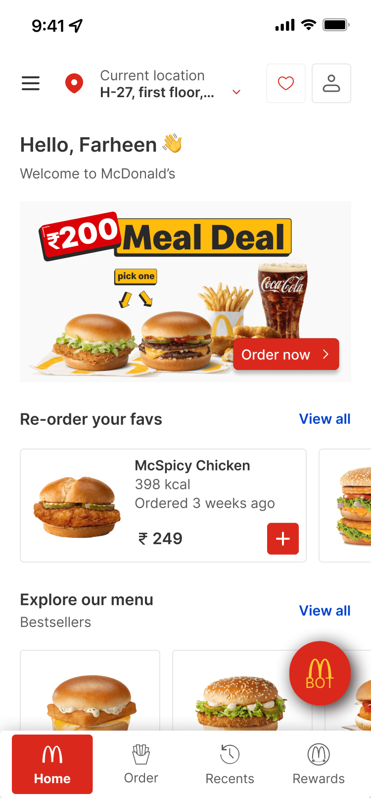
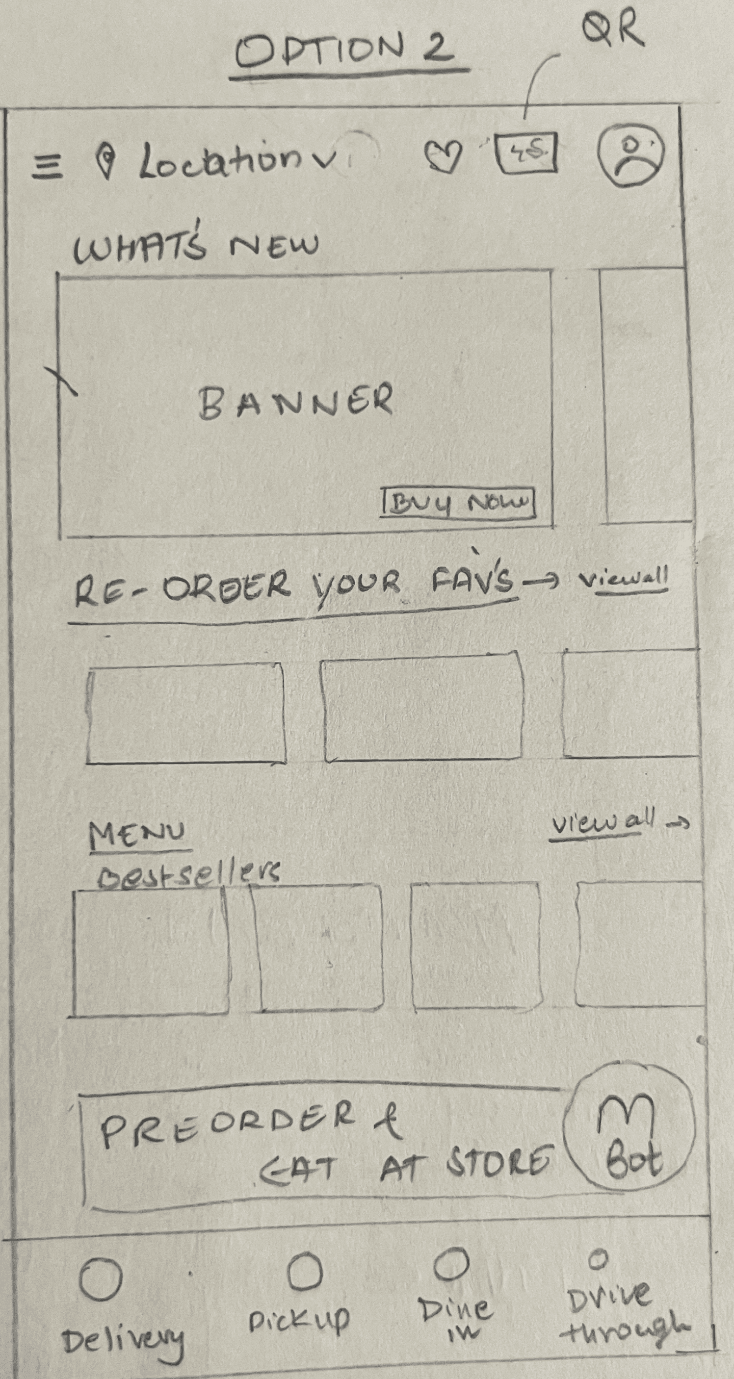
Hamburger Menu, location of where the order will arrive, favorites option provided, QR scna option provided
Banners have been added with a buy now button
Re-order will be available on the screen
Menu will show bestsellers at first, with view all option at the end.
Pre-odering orders before reaching store is an option as well.
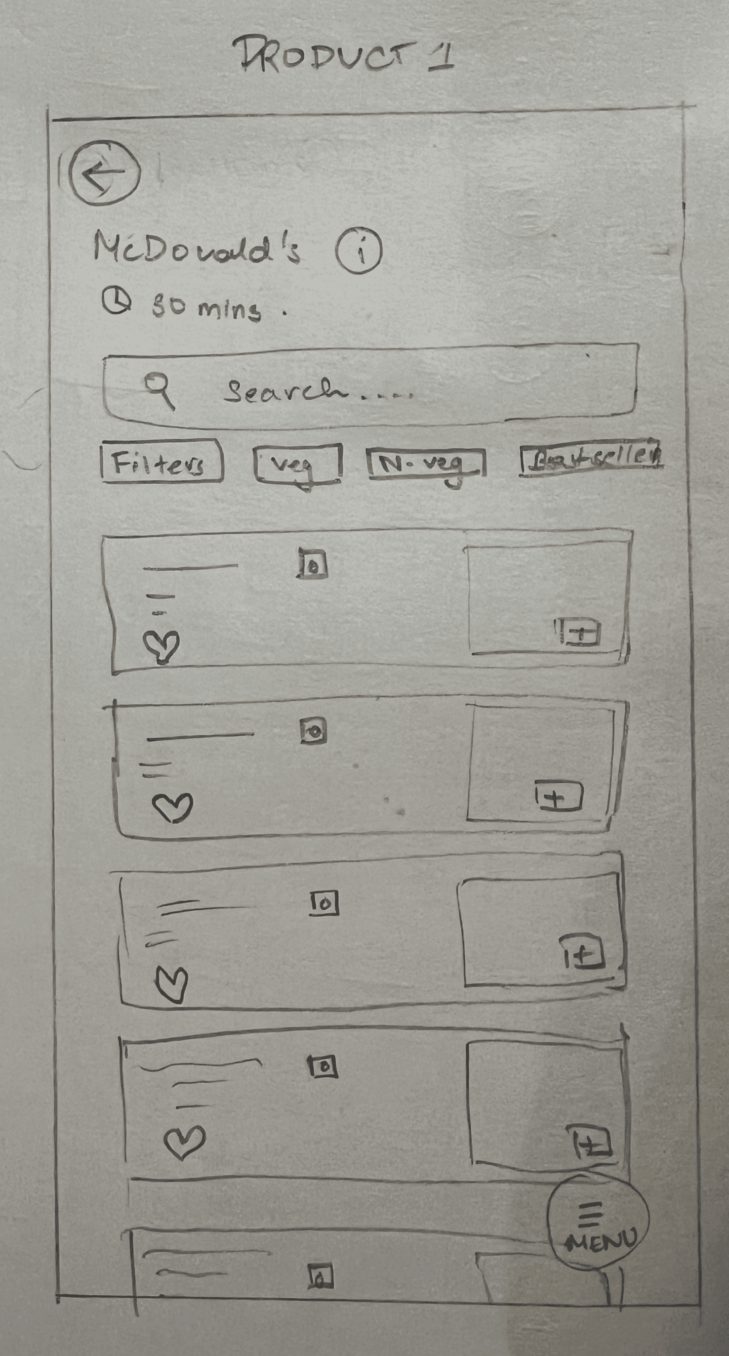
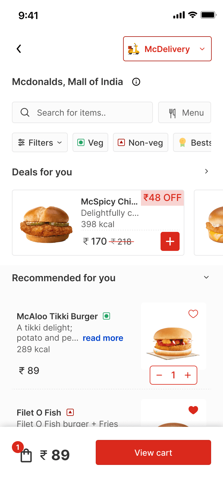
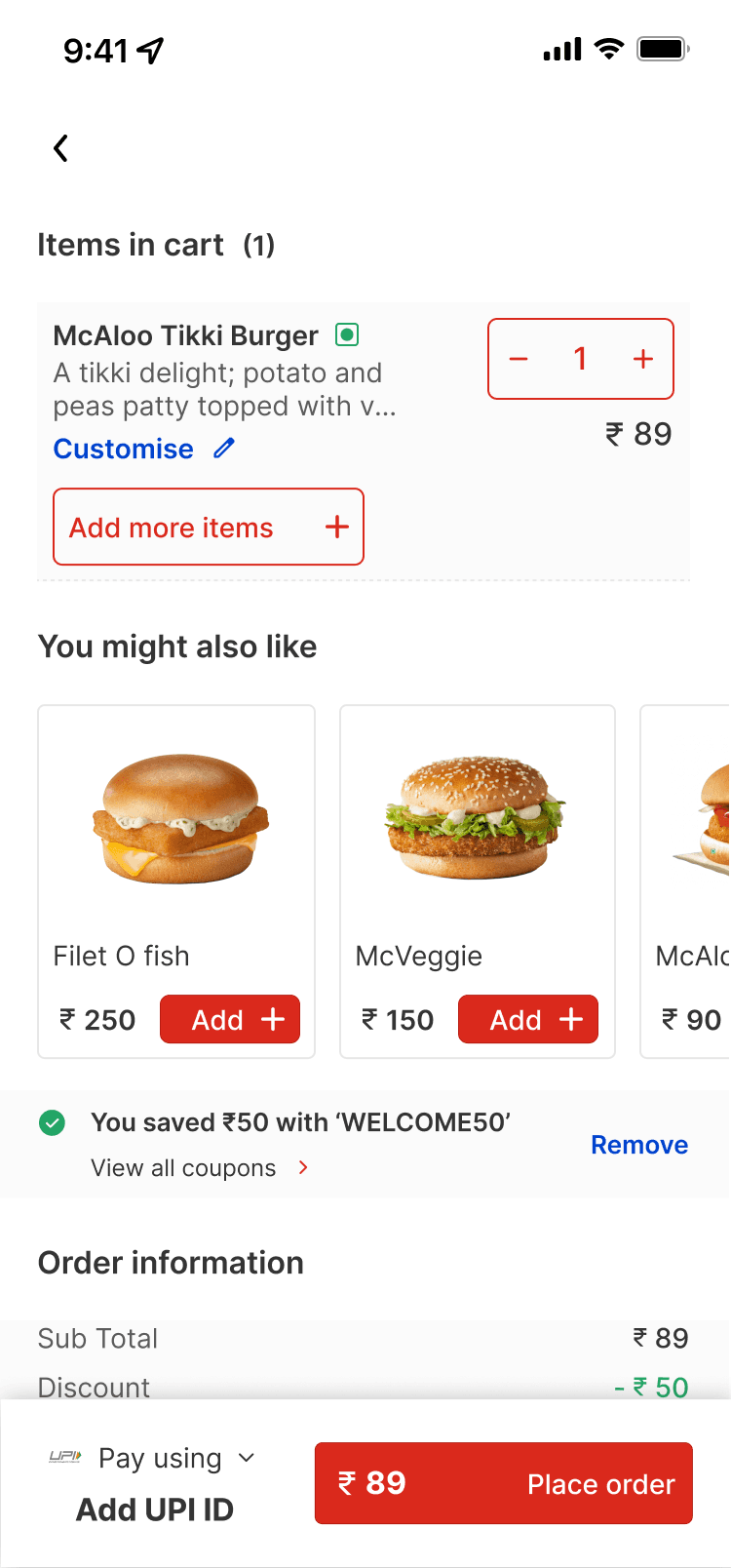
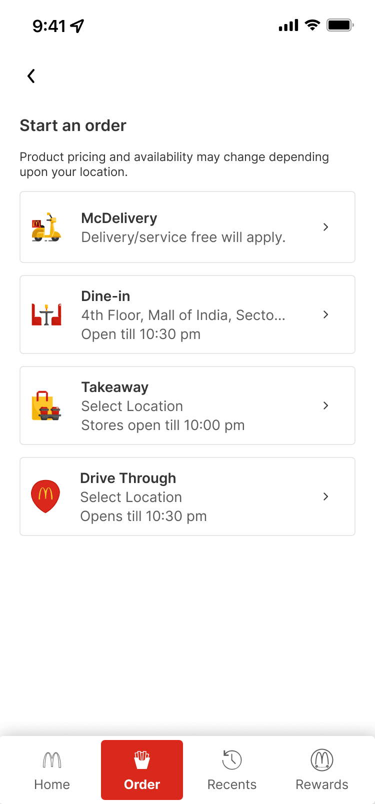
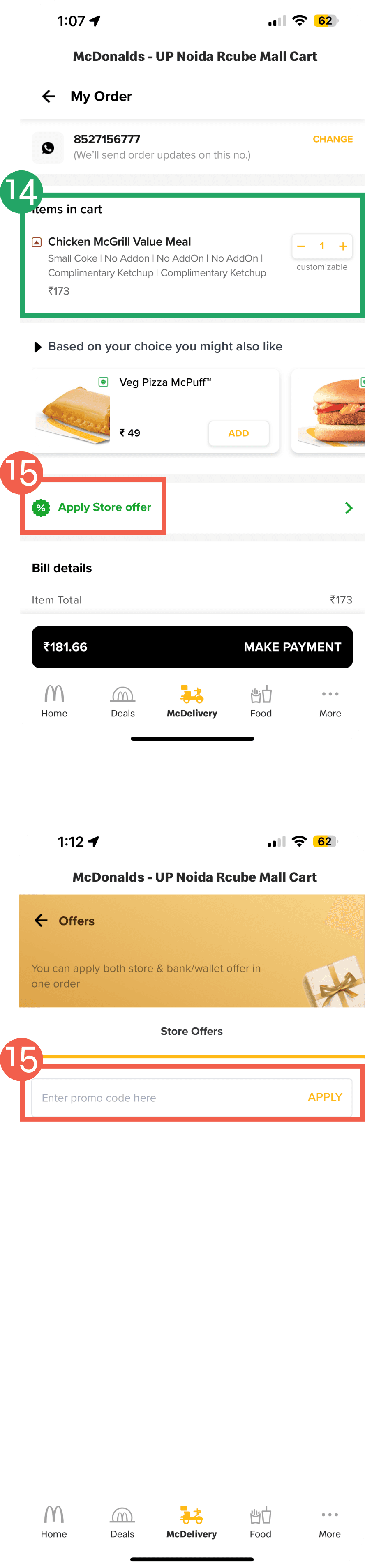
The product page has the location of the store the order will arrive from on top. you can also see the time it would take for it to reach you.
Filters have been added such as, veg, non-veg, bestsellers. The filter section will have more filters such as price, dietary preference.
The menu will also have a heart, so the user can like their fav items.
Menu button will be floating on bottom of the screen.
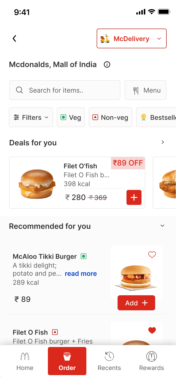
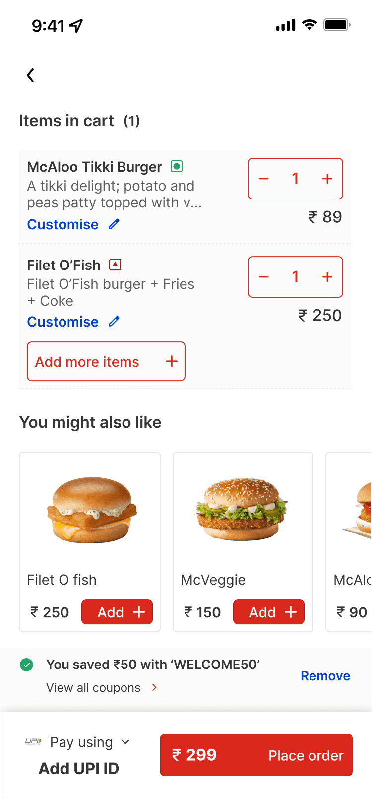
The product page has the location of the store the order will arrive from on top. you can also see the time it would take for it to reach you.
Filters have been added such as, veg, non-veg, bestsellers. The filter section will have more filters such as price, dietary preference.
The menu will also have a heart, so the user can like their fav items.
Menu button and search button will be together at the bottom of the page
You will also be able to view your previous orders.
9:41


9:41
9:41
9:41

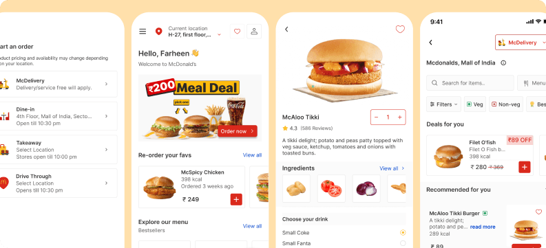
Homepage
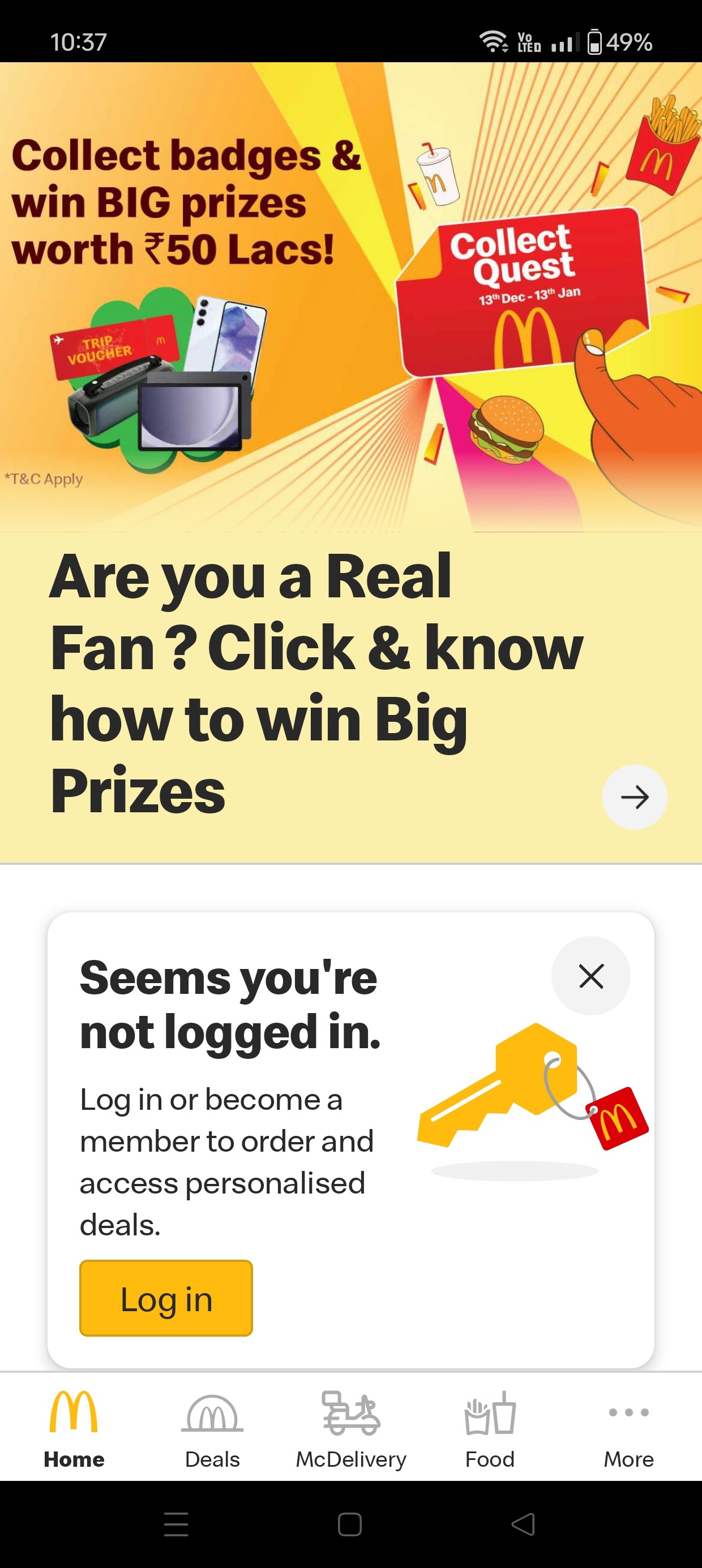
Excessive banners & coupons were there on the homepage.
No information for the user on where to start.
Top banner taking majority of the space.
Homepage REDESIGN
Primary Nav has been changed
Cleaner design with less banners and coupons. Banners have a clear CTA.
Glimpse deals and menu can now be on the homepage itself - instead of going to McDelivery screen.
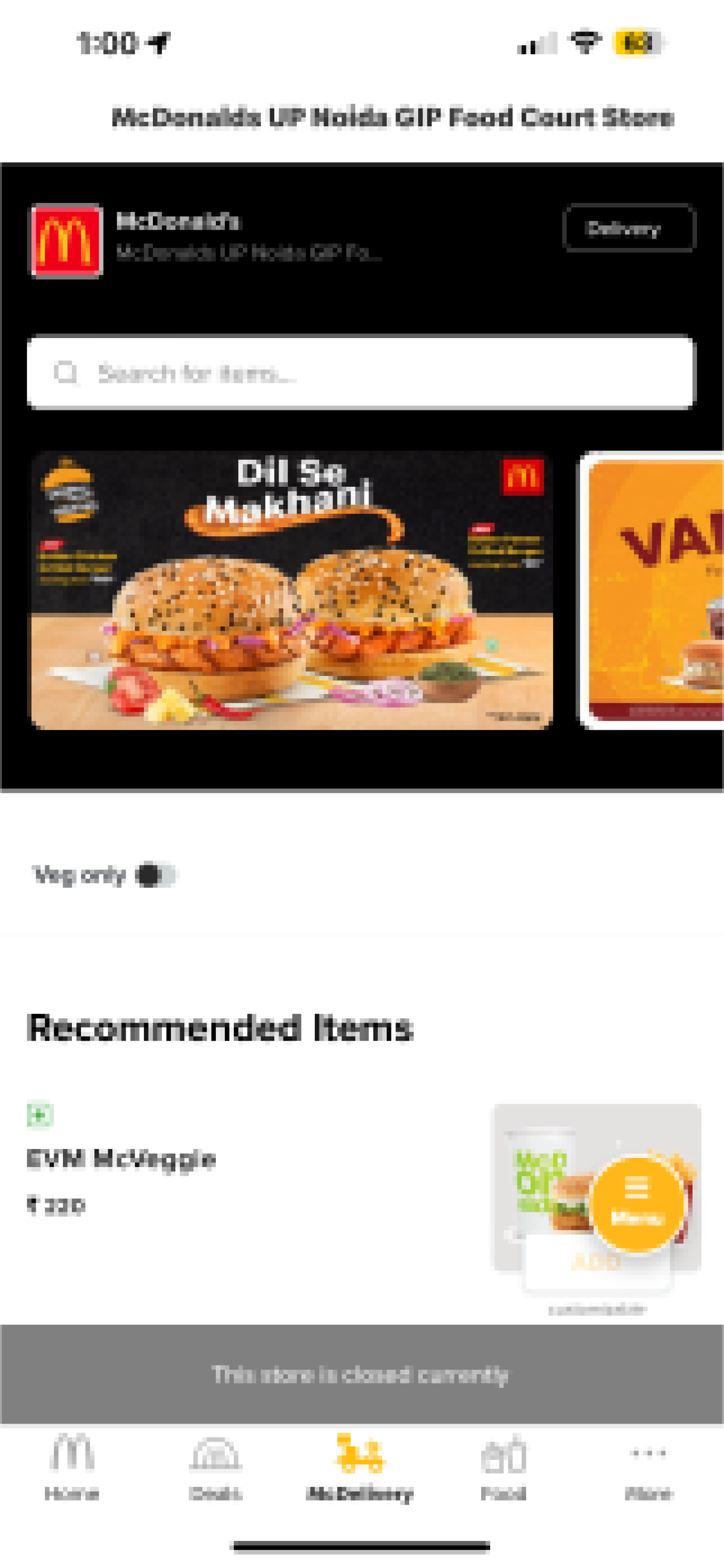
Menu Screen
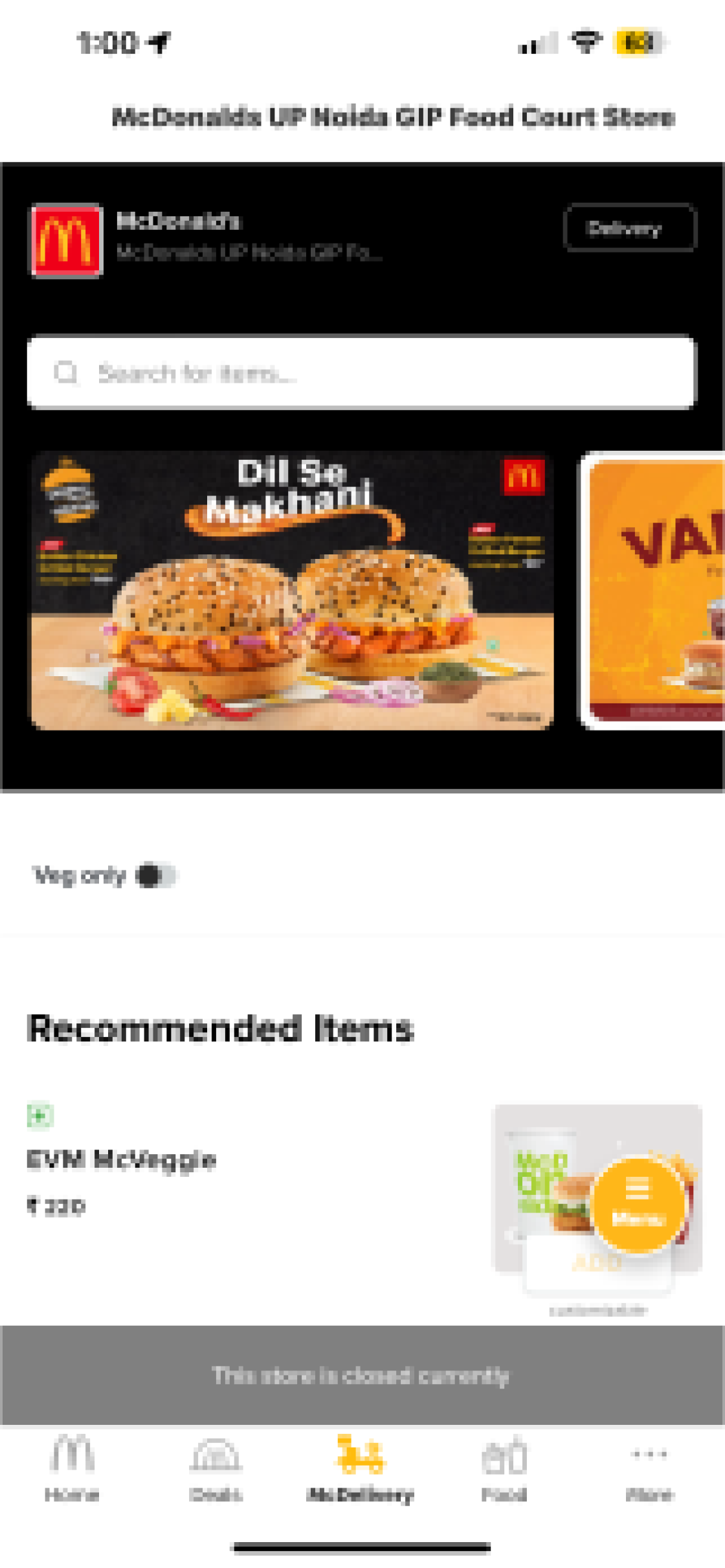
No filters, except veg
Heading without any actionable header.
Cluttered banner with no CTA.
Menu doesn't load, need to reopen app just to be able to view the menu.
Food tab, shows ingredient list and nutritional information.
There isn't enough emphasis on the floating menu button
Menu Screen REDESIGN
No banners have been added
Simplifying the design for a cleaner look
Deals - Price and discounts have been shown in a clear manner with prominent CTAs.
Menu button has been shifted to the top of the screen along with a search bar.
The option of liking your fav food items has been added.
User has the option of switching between delivery/ dine-in/ takeaway and drive through at the top of the screen.
X 5
“The design is nice, the pages aren't too full of information, I like how the homepage has now been divided into separate sections, i can choose whichever i want easily.”
“I like how there is a bot in the app, because i am not as tech-savvy and having a feature like this would help me place an order faster. If you actually develop something like this, you would be saving me and a lot of other people, a lot of time and effort”
“ I am glad the filters were added, but i wish i could see what filters would be added to the app, as of now i am unable to view those.”
“The design is a lot cleaner than the original McD app, but the images do take some time to load. The original homepage was full of just coupon/offers. I think being able to have a glimpse of everything available on the app is nice.”
“I like how I can see my previous orders. I also like that I can see the ingredients list as soon as I open the item. I also like how i can favourite any item that I want, makes it easier for me to find it later on.”
“The McBot should be added to the real app as well, I think that would help a lot of people save time. They would then be able to simple order through the bot.”